

Foundation
Color
See the example first, understand the rule, then inspect the token. Ordering.co uses one fixed identity palette inside Light and Dark interface environments.
01 / Identity at a glance
One clear answer before the full system
Canvas and primary content adapt to the interface theme. Action Blue, operational indicators and the four-color symbol remain fixed.
Adaptive neutral
Canvas
Light #FFFFFF · Dark #0B0C0D
Adaptive neutral
Primary content
Light #0B0C0D · Dark #FFFFFF
Fixed identity
Action Blue
#266DF0 · Light and Dark
Fixed indicators
Operational states
Success · Warning · Danger
Fixed recognition
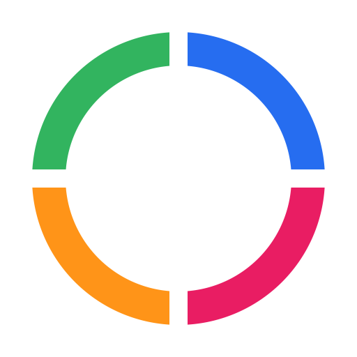
Logo palette
Masterbrand symbol only
Neutrals adapt. Identity stays.
The current theme changes the environment without creating a second brand palette.
#266DF002 / Light & Dark by example
The identity stays. The interface adapts.
Compare the same Ordering.co interface in both environments. The callouts identify what changes; the action, focus, indicators and logo show what remains fixed.
Light interface
Same identity, adapted environment
Marketplace overview
Illustrative interface specimen
System status
Operational
Primary content
View activityFocus uses the same Action Blue in both themes.
- Canvas
- #FFFFFF
- Surface
- #FFFFFF
- Subtle surface
- #F6F7F7
- Primary content
- #0B0C0D
- Muted content
- #3F4145
- Border
- #DEE0E3
Dark interface
Same identity, adapted environment
Marketplace overview
Illustrative interface specimen
System status
Operational
Primary content
View activityFocus uses the same Action Blue in both themes.
- Canvas
- #0B0C0D
- Surface
- #17181A
- Subtle surface
- #212224
- Primary content
- #FFFFFF
- Muted content
- #C4C6CA
- Border
- #34363A
Adaptive interface roles
Fixed identity roles
03 / Color in use
Blue shows where to act
Use Action Blue for the primary action, meaningful links, selection and keyboard focus. Logo colors and operational colors carry different jobs.
Approved action roles
Blue shows where to act
Avoid
Recognition and state are not actions
Pink belongs to the masterbrand symbol.
Green communicates operational state.
04 / Operational states
One meaning, three visible roles
A state uses a fixed signal plus readable content and a soft background. Content and background adapt so the same meaning remains clear in Light and Dark.
Signal
A redundant color dot or icon that stays fixed.
Readable content
Explicit status text that adapts for contrast.
Soft background
A supporting surface that adapts to the theme.
Light states
Same meaning, accessible treatment
- Signal
- #00D17E
- Readable content
- #0B0C0D
- Soft background
- #E7F8F0
- Signal
- #F5A300
- Readable content
- #0B0C0D
- Soft background
- #FFF3D6
- Signal
- #EB3B3B
- Readable content
- #C92929
- Soft background
- #FDEBEC
Dark states
Same meaning, accessible treatment
- Signal
- #00D17E
- Readable content
- #00D17E
- Soft background
- #0F3828
- Signal
- #F5A300
- Readable content
- #F5A300
- Soft background
- #3D2D07
- Signal
- #EB3B3B
- Readable content
- #FF6B6B
- Soft background
- #461A1D
05 / Recognition boundary
Keep the four-color symbol together
The symbol is a recognition layer, not a source of interface accents. Blue may serve both namespaces through separate governed roles; green, orange and pink remain restricted outside operational meaning and the masterbrand asset.
One complete recognition asset
Do
Avoid
Operational exception
Blue namespace
--od-action for interface action and --od-logo-blue inside the masterbrand asset.06 / Technical reference
Implementation detail, when you need it
The examples above teach the behavior. Open these references only when you need exact Light/Dark values, token names or component mappings.
Theme rolesSee the interface role first; inspect its token only when implementing it.
| Role | Light | Dark | Used for |
|---|---|---|---|
| CanvasPage background | Light #FFFFFF | Dark #0B0C0D | Page background |
| SurfaceCards and panels | Light #FFFFFF | Dark #17181A | Cards and panels |
| Subtle surfaceSelected regions and grouping | Light #F6F7F7 | Dark #212224 | Selected regions and grouping |
| Primary contentHeadings and body text | Light #0B0C0D | Dark #FFFFFF | Headings and body text |
| Muted contentSecondary information | Light #3F4145 | Dark #C4C6CA | Secondary information |
| BorderDividers and controls | Light #DEE0E3 | Dark #34363A | Dividers and controls |
| Action contentLinks and selected text | Light #1F5FD1 | Dark #92B5FF | Links and selected text |
| Action softSelection backgrounds | Light #EDF3FF | Dark #17284A | Selection backgrounds |
View token details · 32
theme.light.semantic.background--od-bg#FFFFFFtheme.light.semantic.surface.default--od-surface#FFFFFFtheme.light.semantic.surface.subtle--od-surface-subtle#F6F7F7theme.light.semantic.surface.strong--od-surface-strong#0B0C0Dtheme.light.semantic.text.default--od-text#0B0C0Dtheme.light.semantic.text.muted--od-text-muted#3F4145theme.light.semantic.text.subtle--od-text-subtle#3F4145theme.light.semantic.text.inverse--od-text-inverse#FFFFFFtheme.light.semantic.border.default--od-border#DEE0E3theme.light.semantic.border.strong--od-border-strong#989AA0theme.light.semantic.action.default--od-action#266DF0theme.light.semantic.action.foreground--od-action-foreground#FFFFFFtheme.light.semantic.action.content--od-action-content#1F5FD1theme.light.semantic.action.hover--od-action-hover#1F5FD1theme.light.semantic.action.soft--od-action-soft#EDF3FFtheme.light.semantic.action.focus--od-focus#266DF0theme.dark.semantic.background--od-bg#0B0C0Dtheme.dark.semantic.surface.default--od-surface#17181Atheme.dark.semantic.surface.subtle--od-surface-subtle#212224theme.dark.semantic.surface.strong--od-surface-strong#FFFFFFtheme.dark.semantic.text.default--od-text#FFFFFFtheme.dark.semantic.text.muted--od-text-muted#C4C6CAtheme.dark.semantic.text.subtle--od-text-subtle#989AA0theme.dark.semantic.text.inverse--od-text-inverse#0B0C0Dtheme.dark.semantic.border.default--od-border#34363Atheme.dark.semantic.border.strong--od-border-strong#5B5E64theme.dark.semantic.action.default--od-action#266DF0theme.dark.semantic.action.foreground--od-action-foreground#FFFFFFtheme.dark.semantic.action.content--od-action-content#92B5FFtheme.dark.semantic.action.hover--od-action-hover#1F5FD1theme.dark.semantic.action.soft--od-action-soft#17284Atheme.dark.semantic.action.focus--od-focus#266DF0Operational statesSignal, readable content, and soft background values across Light and Dark.
| Role | Light | Dark | Used for |
|---|---|---|---|
| Success · SignalRedundant status dot or icon | Light #00D17E | Dark #00D17E | Redundant status dot or icon |
| Success · Readable contentExplicit status text | Light #0B0C0D | Dark #00D17E | Explicit status text |
| Success · Soft backgroundSupporting status surface | Light #E7F8F0 | Dark #0F3828 | Supporting status surface |
| Warning · SignalRedundant status dot or icon | Light #F5A300 | Dark #F5A300 | Redundant status dot or icon |
| Warning · Readable contentExplicit status text | Light #0B0C0D | Dark #F5A300 | Explicit status text |
| Warning · Soft backgroundSupporting status surface | Light #FFF3D6 | Dark #3D2D07 | Supporting status surface |
| Danger · SignalRedundant status dot or icon | Light #EB3B3B | Dark #EB3B3B | Redundant status dot or icon |
| Danger · Readable contentExplicit status text | Light #C92929 | Dark #FF6B6B | Explicit status text |
| Danger · Soft backgroundSupporting status surface | Light #FDEBEC | Dark #461A1D | Supporting status surface |
View token details · 18
theme.light.semantic.state.success.signal--od-success-signal#00D17Etheme.light.semantic.state.success.functional--od-success-functional#0B0C0Dtheme.light.semantic.state.success.soft--od-success-soft#E7F8F0theme.light.semantic.state.warning.signal--od-warning-signal#F5A300theme.light.semantic.state.warning.functional--od-warning-functional#0B0C0Dtheme.light.semantic.state.warning.soft--od-warning-soft#FFF3D6theme.light.semantic.state.danger.signal--od-danger-signal#EB3B3Btheme.light.semantic.state.danger.functional--od-danger-functional#C92929theme.light.semantic.state.danger.soft--od-danger-soft#FDEBECtheme.dark.semantic.state.success.signal--od-success-signal#00D17Etheme.dark.semantic.state.success.functional--od-success-functional#00D17Etheme.dark.semantic.state.success.soft--od-success-soft#0F3828theme.dark.semantic.state.warning.signal--od-warning-signal#F5A300theme.dark.semantic.state.warning.functional--od-warning-functional#F5A300theme.dark.semantic.state.warning.soft--od-warning-soft#3D2D07theme.dark.semantic.state.danger.signal--od-danger-signal#EB3B3Btheme.dark.semantic.state.danger.functional--od-danger-functional#FF6B6Btheme.dark.semantic.state.danger.soft--od-danger-soft#461A1DPrimitive scalesRaw maintenance ingredients, not additional brand choices.
Ink
10 valuesNeutral
3 valuesBlue
10 valuesMasterbrand
4 valuesBlue 600ActionComponents request the semantic role. They do not choose a primitive by eye.
View token details · 27
primitive.color.ink.100--od-ink-100#EEEFF1primitive.color.ink.200--od-ink-200#DEE0E3primitive.color.ink.300--od-ink-300#C4C6CAprimitive.color.ink.400--od-ink-400#989AA0primitive.color.ink.500--od-ink-500#707278primitive.color.ink.600--od-ink-600#3F4145primitive.color.ink.700--od-ink-700#212224primitive.color.ink.800--od-ink-800#17181Aprimitive.color.ink.900--od-ink-900#111214primitive.color.ink.950--od-ink-950#0B0C0Dprimitive.color.neutral.50--od-neutral-50#F6F7F7primitive.color.canvas--od-canvas#FFFFFFprimitive.color.white--od-white#FFFFFFprimitive.color.blue.50--od-blue-50#EDF3FFprimitive.color.blue.100--od-blue-100#DCE8FFprimitive.color.blue.200--od-blue-200#BDD2FFprimitive.color.blue.300--od-blue-300#92B5FFprimitive.color.blue.400--od-blue-400#6394FAprimitive.color.blue.500--od-blue-500#4E8CFCprimitive.color.blue.600--od-blue-600#266DF0primitive.color.blue.700--od-blue-700#1F5FD1primitive.color.blue.800--od-blue-800#194AA5primitive.color.blue.900--od-blue-900#183D7Dprimitive.color.logo.blue--od-logo-blue#266DF0primitive.color.logo.green--od-logo-green#32B45Fprimitive.color.logo.orange--od-logo-orange#FF9418primitive.color.logo.pink--od-logo-pink#E91D63Component tokensHow governed components consume semantic color roles.
| Role | Light | Dark | Used for |
|---|---|---|---|
| PageApplication canvas | Light #FFFFFF | Dark #0B0C0D | Application canvas |
| CardCards and panels | Light #FFFFFF | Dark #17181A | Cards and panels |
| Subtle regionGrouped content | Light #F6F7F7 | Dark #212224 | Grouped content |
| Primary buttonDefault action fill | Light #266DF0 | Dark #266DF0 | Default action fill |
| Primary hoverHover state | Light #1F5FD1 | Dark #1F5FD1 | Hover state |
| Primary labelText on primary action | Light #FFFFFF | Dark #FFFFFF | Text on primary action |
| Secondary buttonSecondary action fill | Light #FFFFFF | Dark #17181A | Secondary action fill |
| Secondary labelSecondary action text | Light #0B0C0D | Dark #FFFFFF | Secondary action text |
| Secondary borderSecondary control edge | Light #DEE0E3 | Dark #34363A | Secondary control edge |
| Focus ringKeyboard focus | Light #266DF0 | Dark #266DF0 | Keyboard focus |
Semantic roles consumed by real components
Components request roles; they never choose a raw color by eye.
- Primary button
--od-action--od-action-foreground--od-action-hover- Default fill, label, and documented hover
- Input
--od-surface--od-border--od-focus- Field fill, boundary, and keyboard focus
- Selected navigation
--od-action-soft--od-action-content- Selected background and readable label
- Status badge
--od-*-soft--od-*-functional--od-*-signal- Soft background, readable text, and a distinct signal dot or icon
View token details · 20
theme.light.component.pageBackground--od-component-page-bg#FFFFFFtheme.light.component.cardBackground--od-component-card-bg#FFFFFFtheme.light.component.subtleBackground--od-component-subtle-bg#F6F7F7theme.light.component.primaryBackground--od-button-primary-bg#266DF0theme.light.component.primaryHover--od-button-primary-hover#1F5FD1theme.light.component.primaryForeground--od-button-primary-text#FFFFFFtheme.light.component.secondaryBackground--od-button-secondary-bg#FFFFFFtheme.light.component.secondaryForeground--od-button-secondary-text#0B0C0Dtheme.light.component.secondaryBorder--od-button-secondary-border#DEE0E3theme.light.component.focusRing--od-focus-ring-color#266DF0theme.dark.component.pageBackground--od-component-page-bg#0B0C0Dtheme.dark.component.cardBackground--od-component-card-bg#17181Atheme.dark.component.subtleBackground--od-component-subtle-bg#212224theme.dark.component.primaryBackground--od-button-primary-bg#266DF0theme.dark.component.primaryHover--od-button-primary-hover#1F5FD1theme.dark.component.primaryForeground--od-button-primary-text#FFFFFFtheme.dark.component.secondaryBackground--od-button-secondary-bg#17181Atheme.dark.component.secondaryForeground--od-button-secondary-text#FFFFFFtheme.dark.component.secondaryBorder--od-button-secondary-border#34363Atheme.dark.component.focusRing--od-focus-ring-color#266DF0